Data Quantity in Kibana
Plot Data Quantity using Kibana
In this article, we describe how you use Kibana to monitor the number of data records each participant uploads during a certain time period. If you are not familiar with how Kibana works with Avicenna, you can read the Kibana Basics page first and then continue here.
Start by opening Kibana from your Researcher Dashboard. Now from the left panel, go to the Visualize tab, click on the
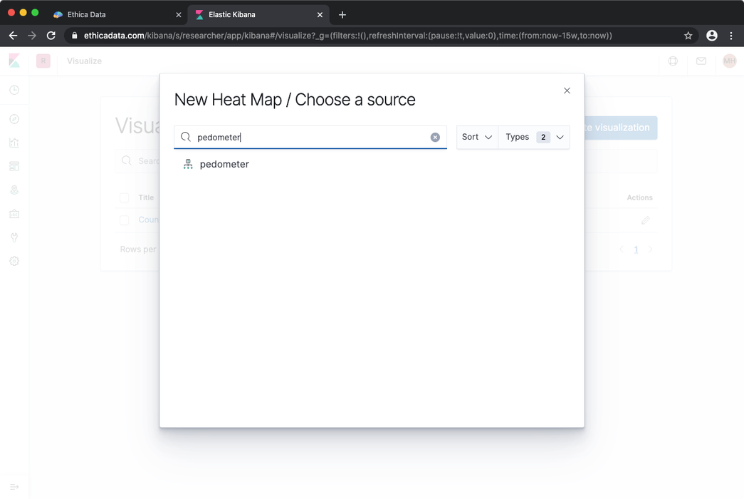
Create Visualization button and from the list choose Heat Map visualization. In the dialog that opens, search for
the data index you want to use. Here, we want to use the Pedometer data, so we search for it in the list:
After selecting the data source, a graph is shown based on the default parameters. We need to adjust these parameters using the left-side panel:
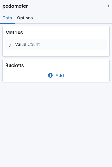 |
In the Data tab, in the Metrics section, expand the Value Count and ensure the Aggregation is set to Count (the
default option). This specifies that for each cell of our heat map (or for each bucket, as called in Kibana), we want to
count the number of records in that bucket and plot the aggregate result. If you are not familiar with how metrics and
buckets work in Elasticsearch and Kibana, this 10-minute video is a good
introduction.
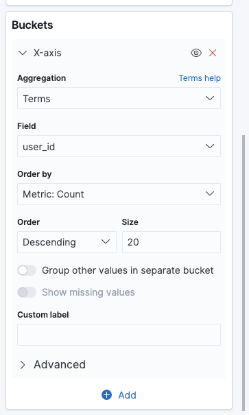
Then we need to define our buckets. For this example, we want to show user IDs in the X-Axis and dates on the Y-Axis. We
can define that in the Buckets section. Click on the + icon, choose X-Axis, from the Aggregations list select
Terms, and set the Field to user_id. You can specify the order of the data by setting the Order By field. The
last field is the Size. You can use Size to specify how many user IDs to be returned. Here I set it to 20.
 |
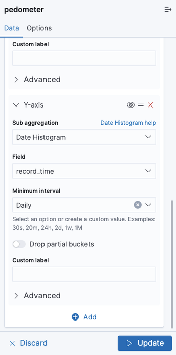
To specify the Y-Axis, click on + again, and choose Y-Axis. We want to aggregate the data per date. So choose
Date Histogram and set the Field value to record_time. Also, set the interval to Daily, so the plot will show
aggregate data over date. When done, click on the Update button on the bottom right corner of the panel to apply the
changes.
 |
Also, don't forget to select a time window from the top right corner of the page. By default, it's set to show the data from the last 15 minutes. But for most cases, there is not enough data to plot and you will get an empty graph. Here I set the time range to the past 15 weeks instead:
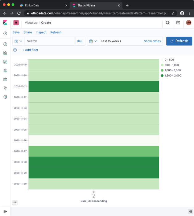
As I only had one participant in my study, the X access has only one item. You can move the cursor on the graph, and for each cell you can see the date, the user ID, and the number of records that user has provided on that date.
You can also use filters to put criteria on the records which are being counted. This filter can be based on any field
in the data. Obviously, you can filter data to include or exclude specific users. Moreover, as we are using GPS data
here, you can filter data based on a specific geo-region, or the speed. To do that, simply click on the Add a filter
on the top left corner of the screen, and you can define your filter.
Special Case: Survey Responses
The above example counts the number of records stored in Kibana for each user for each date. This generates a valid data
quantity report for all data sources in Avicenna, except Survey Responses. As we
explained before, Avicenna stores response to each question as a separate record. So if a
survey has 10 questions and the user responds to 8 of them, Avicenna will store 8 separate records for that session, one
per response. Each record contains 5 date fields: scheduled_time, issued_time, record_time, rel_record_time, and
resp_time. You can read more about each of these fields here. Except resp_time, all
other 4 fields are identical for all responses to a specific session. So in the example above, all 8 responses will
contain identical values for scheduled_time, issued_time, record_time, and rel_record_time.
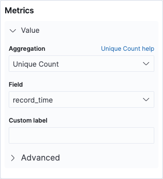
So if you want to count the number of survey sessions per participant per day, all configuration remains the same as above, except the metric. For metric, you need to use you need to set the metric to Unique Count of one of the 4 date values, as shown below.
 |
| Configuration for Plotting Survey Responses |